

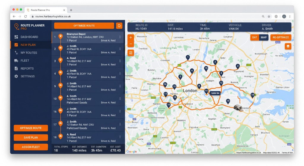
Operations platform
Route Planner Pro
OutcomeRoute efficiency
TypeOperations dashboard
Learn more
26Healthcare · Case study
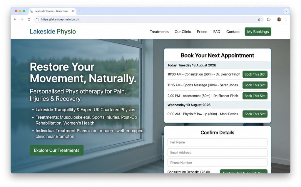
Therapy service site with treatment pages, clinician profiles, and booking CTA. We delivered the services website as a live conversion surface for treatment bookings.
01The delivered site
The layout we shipped for this project — desktop first, with a phone view where we have one.
02The brief
What we were hired to fix
Lakeside Physio needed a services website that did one commercial job: treatment bookings. Therapy service site with treatment pages, clinician profiles, and booking CTA.
The constraint was not “more pages”. It was a healthcare audience who would leave if the next step was vague. We treated that as the brief, not a later optimisation.
We shipped a finished services website — copy, layout and conversion path — so the team could run treatment bookings from a URL they own.
03What we delivered
We built Lakeside Physio as delivered work, not a concept. Structure, proof and the treatment bookings path were designed together, then implemented as a maintainable front end.
Every block on the page has a job: explain the offer, show evidence, and move a real person to treatment bookings. If it did not do that, it did not ship.
Parents, patients, trade buyers or partners each get a door. One homepage does not try to be all of them.
Tiers, sessions and fixed jobs with GBP on the card — so the quote form is a confirmation, not a first contact.
Slots, discovery calls or quote forms sit next to the offer, not three clicks later in a buried contact page.
New packages slot into the same grid without a redesign when the firm grows.
04Outcomes
Visitors can complete treatment bookings without a sitemap. The action sits where the offer is.
Lakeside Physio reads as a healthcare services website — not a reused template with the logo swapped.
The same structure takes a new offer, SKU or workflow without starting again.
—More work
Next step
A short call with the person who would run it — not a sales script.