

Operations platform
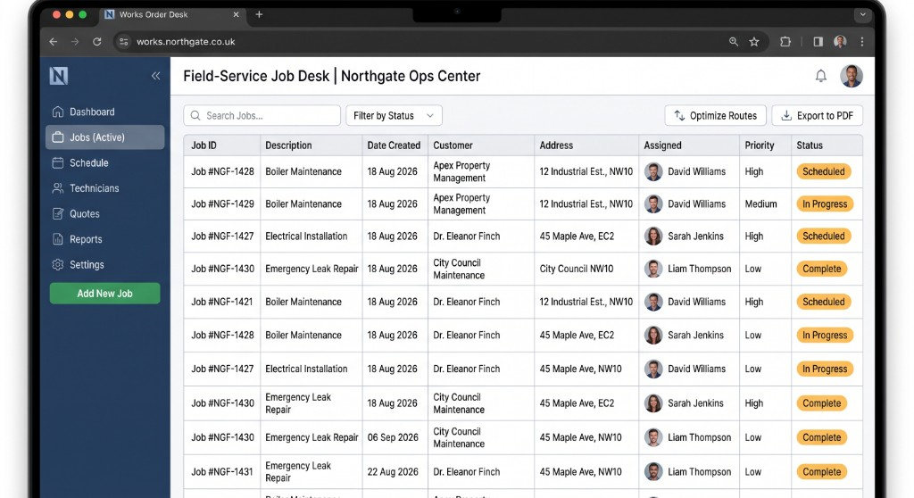
Works Order Desk
OutcomeFaster job turnaround
TypeOperations dashboard
Learn more
03Primary education · Case study
A Church of England primary school needed a welcoming, accessible website for parents — ethos, calendar, policies and day-to-day information without noise.
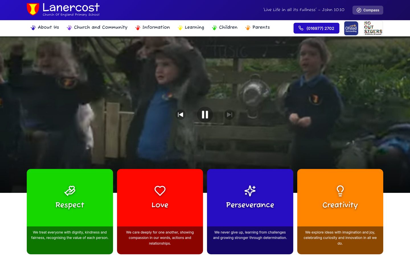
01The delivered site
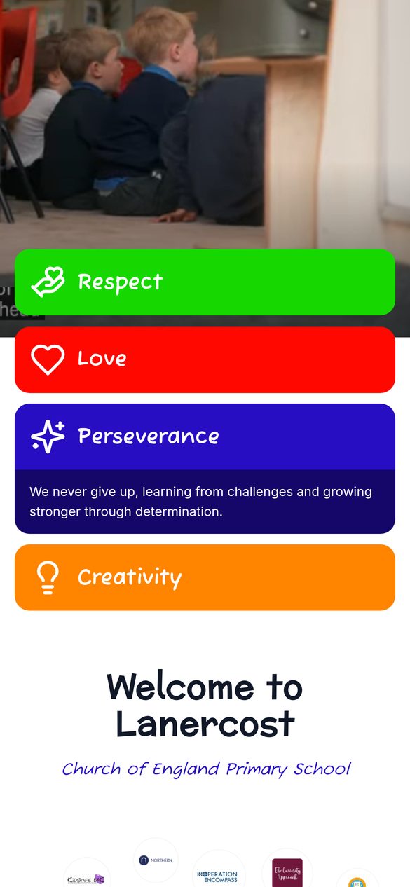
The layout we shipped for this project — desktop first, with a phone view where we have one.
02The brief
What we were hired to fix
Term dates, policies, safeguarding and “what happens next” questions pile up in the office when the website cannot answer them. Schools also carry statutory publishing duties that generic templates often bury.
Lanercost needed a site that felt warm and clear — church school values, practical information, mobile-first for parents on the gate.
03What we delivered
We prioritised the pages parents actually open: about the school, admissions, calendar, policies and contact — with typography and hierarchy that stay readable on a phone between drop-off and pickup.
Accessibility and content structure were treated as requirements, not polish.
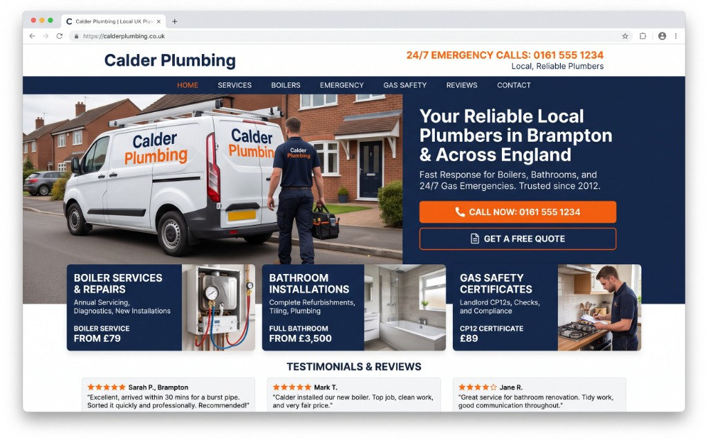
Home, services, proof, contact — no CMS maze. Each page has a job and a way back to an enquiry.
Areas served, reviews, prices where they help, and photography that matches the trade.
Phone, quote and visit CTAs stay visible. The site is a receptionist, not a brochure rack.
Copy and images sit where a busy owner can update them without a rebuild every quarter.
04Outcomes
Key information is reachable without hunting through outdated menus.
Church school identity and community tone without decorative clutter.
Fewer repeat questions when policies and calendars are easy to find.
—More work
Next step
A short call with the person who would run it — not a sales script.